日本語WEBフォントとHelveticaやDINに似ているフォントをGoogle Fontsで探す
- Published: 2017-11-11
- Updated: 2025-11-22
![]() better standard editor
better standard editor
WEBフォントを利用してWEBサイトやWEBページを制作するケースが多くなってきています。
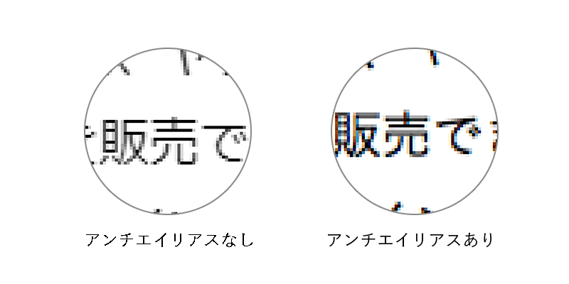
欧文については、フリーで使える Google Fonts のおかげでアンチエイリアスがついていて綺麗な曲線が表現されているフォントをWEBページにも使えるので、フォントの選択肢が増えることでデザインの幅が広がると同時に、テキストデータですのでSEO的にみても効果があります。とくにモバイル環境から閲覧される場合においては、モバイル端末の画面がPCに比べるとほぼ倍と詳細微細になってきているために、そのままPC用に用意した画像で表現すると荒く見えることもあり、できるだけテキストでの表現を心がけた方がデータの軽さ的にも検索エンジンなどの機械的な読み上げなどの面からも望ましいです。画像もPC用に表示するファイルのほかに倍程度の画像を用意すれば、綺麗に表示することも可能ですが、ただでさえ通信帯域が細い環境に4倍ほどの情報を配信することが適当ではありません。(倍といっても縦横あるのでピクセル数は4倍になります)
Macでの閲覧環境においては、かなり以前よりブラウザでみるWEBページのフォントはスムースな表示となっていますが、Windowsデバイスでは、現在でもアンチエイリアスなしで表示するのがデフォルトとなっています。フォントをスムースにするCSSプロパティーやハックなどもありますが、一般的にWindowsのマシンではスムーズなフォントで表示されない現状があり、Windowsでもスムースなフォントで表示させたいということも多いですし、フォントを変えることで雰囲気が変わってきますので、ユーザーに与える印象も変わってきます。是非とも効果的に使いたいところですが、デメリットや使い方にはどのようなものがあるのでしょうか?
日本語こそWEBフォントを使いたい
現在のWEBフォントの利用環境が劇的に改善しているなかで、WEBページのほとんどを占める日本語にこそ、WEBフォントを使いたいと考えるのは自然な流れであるとおもいます。しかしながら、日本語フォントについては、文字数の多さ、画数の多さなどフォントデータ自体が重くなる傾向もあり、なかなか利用する機会がないのが現状です。利用するには、フォントファイルをサーバーにアップするか、Googleが提供している Google noto sans を代表とした早期アクセスの中から使うか、Adobe Typekitなどの有料のサービスを利用することになります。
日本語のWEBフォントサービス
WEBフォントのツールやサービスが増えており、それにともない使える日本語フォントも増えていますが、ファイルの重さもあり、全面的に実用できるケースは増えてはいないです。Adobe Typekitは Creative Cloud を利用していればWEB上の設定で、モリサワやフォントワークス、字游工房などの有名どころのフォントを使用することができます。500,000ページビュー/月までであれば、Creative Cloud に付随しているライセンスで使えますし、25,000ページビュー/月 までであれば無料で使用することが可能です。ただ、日本語のフォントデータが重いのか、フォントの読み込みに多少のタイムラグがあり表示が一瞬ずれてしまうように見えることもあります。体感的には Google Fonts の方が表示が早いような気がしますが、メニューや見出しやキャッチコピーなどのポイントに使用する程度にとどめておいた方が無難です。Fonts.comは、250,000 ページビューまで月9.99ドル。appleも使っている AXIS Font Japaneseを使うことができます。また、日本語のWEBフォントについては、ライセンスについても注意が必要です。使えるからといってサーバーにアップして使うことが許されていないフォントも多くありますので、フォントをサーバーにアップして使う場合にはライセンスを一度確認したほうがいいでしょう。
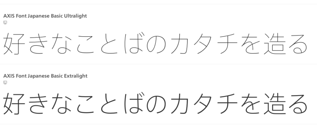
AXIS Font Japanese
レンタルサーバーのサービスにWEBフォントのライセンスが付いている場合がある
レンタルサーバーによっては、使用できるフォントに限りがある場合もありますが、これらの日本語WEBフォントをサービスとして無料で提供されているケースもあるので、フォントを気にしたいなどの場合は、サーバーを選ぶ際に注意してみてもいいでしょう。
モリサワフォントが使えるレンタルサーバー
実際に使用するには読み込みの設定を行う
使い方はCSSで読み込むフォントを指定、フォントを表示させたいところにフォントを指定すればフォントをWEBフォントで表示することができます。下記は、Google FontsのM+ 1pを読み込んで表示する方法です。
<link href="https://fonts.googleapis.com/earlyaccess/mplus1p.css" rel="stylesheet" />
.wf-mplus1p { font-family: "Mplus 1p"; }
いまのところは欧文フォントだけでも使いたい
日本語フォントの現状については、使えるケースも限られますが、フォント自体が軽い欧文フォントでは見出しやメニュー、キャッチコピーなどでも使えることもありますし実際に使っていますので、ゴシック体の有名どころである、HelveticaやDINに似ているフォントをgoogle fontでピックアップしてみました。
HELVETICA(ヘルベチカ)
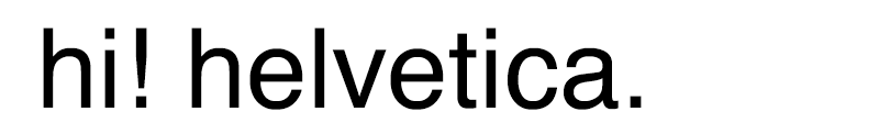
ヘルベチカは1957年にスイス人のマックス・ミーディンガー、エドゥアルト・ホフマン(Eduard Hoffmann)が発表した活字組版用の書体です。すっきりとしていてとても使いやすくいろんなところで使われています。視認性も良く是非、WEBサイトに使ってみたいとことろですが、WEBサイトでそのまま使う場合には画像にして利用するしかないのが現状です。Macには最初からインストールされていますが、Windowsでは入っていなく、Google Fontsには取り扱いはありませんので、形が似ているものをピックアップしたいとおもいます。
Google Fonts から
-
hi! helvetica alternatives
(this is Open Sans)Apparently we had reached a great height in the atmosphere, for the sky was a dead black, and the stars had ceased to twinkle. By the same illusion which lifts the horizon of the sea to the level of the spectator on a hillside, the sable cloud beneath was dished out, and the car seemed to float in the middle of an immense dark sphere, whose upper half was strewn with silver. Looking down into the dark gulf below, I could see a ruddy light streaming through a rift in the clouds.
-
hi! helvetica alternatives
(this is Lato)Apparently we had reached a great height in the atmosphere, for the sky was a dead black, and the stars had ceased to twinkle. By the same illusion which lifts the horizon of the sea to the level of the spectator on a hillside, the sable cloud beneath was dished out, and the car seemed to float in the middle of an immense dark sphere, whose upper half was strewn with silver. Looking down into the dark gulf below, I could see a ruddy light streaming through a rift in the clouds.
-
hi! helvetica alternatives
(this is Noto Sans)Apparently we had reached a great height in the atmosphere, for the sky was a dead black, and the stars had ceased to twinkle. By the same illusion which lifts the horizon of the sea to the level of the spectator on a hillside, the sable cloud beneath was dished out, and the car seemed to float in the middle of an immense dark sphere, whose upper half was strewn with silver. Looking down into the dark gulf below, I could see a ruddy light streaming through a rift in the clouds.
ヘルベチカを使ったロゴ
実は、ヘルベチカを元にして作成されたロゴもいくつかあります。
![]()
![]()
![]()
![]()
アメリカン航空とルフトハンザ航空は近年ロゴをリニューアルしていますが、微調整といったところです。
こちらに、ヘルベチカを使ったロゴの記事があります。パナソニックもヘルベチカベース?
20 famous logos made with Helvetica
DIN(ディン?)
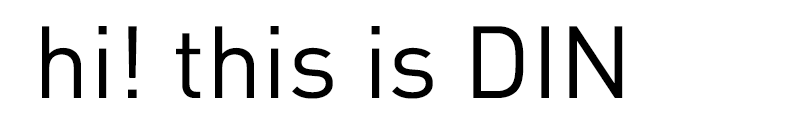
「DIN」というのは「ドイツ工業規格(=Deutsches Institut für Normung)」の略称で、交通標識や行政などの書類や看板表示などの工業用に設計された、わかりやすく、見やすく、シンプルで飾り気のないフォントです。現在ではその見易さなどから商業用の看板などにも多くつかわれています。
Google Fonts から
-
hi! DIN alternatives
(this is Ropa Sans)Apparently we had reached a great height in the atmosphere, for the sky was a dead black, and the stars had ceased to twinkle. By the same illusion which lifts the horizon of the sea to the level of the spectator on a hillside, the sable cloud beneath was dished out, and the car seemed to float in the middle of an immense dark sphere, whose upper half was strewn with silver. Looking down into the dark gulf below, I could see a ruddy light streaming through a rift in the clouds.
-
hi! DIN alternatives
(this is Abel)Apparently we had reached a great height in the atmosphere, for the sky was a dead black, and the stars had ceased to twinkle. By the same illusion which lifts the horizon of the sea to the level of the spectator on a hillside, the sable cloud beneath was dished out, and the car seemed to float in the middle of an immense dark sphere, whose upper half was strewn with silver. Looking down into the dark gulf below, I could see a ruddy light streaming through a rift in the clouds.
- Published: 2017-11-11
- Updated: 2025-11-22
![]() better standard editor
better standard editor